🎯15일차 활동
- 1. 디자인 감각 훈련
- 2.미드저니 웹 미니 특강
- 3. 개인 과제
1. 디자인 감각 훈련
Day 9 (11/21) - 시간 표현
목표: 추상적인 개념(시간)을 제품/이미지로 시각화하고 감정을 분석한다.

활동 가이드
- ‘시간’을 연상시키는 제품, 아이콘, 혹은 간단한 오브젝트를 선택한다.
- 시간성을 시각화할 수 있는 이미지 생성(예: 흐르는 형태, 녹는 시계, 연속된 동작).
- 시간적 요소가 이미지에 미치는 감정적 효과를 기록한다.
오랜 시간의 축적을 직관적이고 현실적으로 표현


추상적이고 상징적으로 표현


기록 가이드
- 원본 제품/이미지: 시간과 무관한 상태에서 주는 느낌과 감정은 무엇인가?
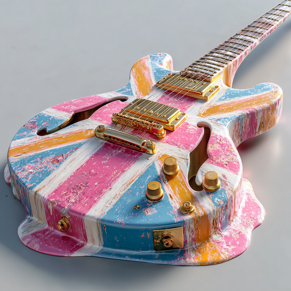
시간 요소가 없는 상태에서 기타는 강렬한 인상을 주었다.
유니언 잭 무늬 자체가 선명한 에너지를 가지고 있어 열정적이고 활기찬 느낌이 컸다.
무늬를 제외하면 매끈하고 윤기가 있는 새로운 제품 같은 이미지가 생성되었는데, 깔끔하고 정돈된 상태가 주는 안정감이 있었다. - 변형 이미지: 시간성을 반영한 후 전달되는 느낌, 긴장감, 흐름 등
현실적인 방식으로 시간을 입힌 이미지들(칠 벗겨짐, 먼지, 사용감)에서는 세월이 남긴 흔적이 느껴졌고, 마치 주인과 함께 지내온 시간과 기억이 함께 묻어 있는 듯한 분위기를 줬다. 전체적으로 차분하고 가라앉으며 약간은 엄숙하게도 보였다.
추상적으로 진행한 이미지들에서는 더 다양하고 복합적인 감정을 느꼈다.
가루가 되어 흩날리는 장면은 순식간에 세월을 통과해 사라지는 느낌을 주었고, 시선 흐름이 명확한 역동성이 있었다.
녹아내리는 형태는 현실의 물리 법칙을 벗어나 있어 초현실적이고 몽환적인 분위기를 만들었다. 다만 달리의 그림같은 느낌을 기대했는데 생각만큼 극단적으로 나오지 않아 아쉬움이 있었다.
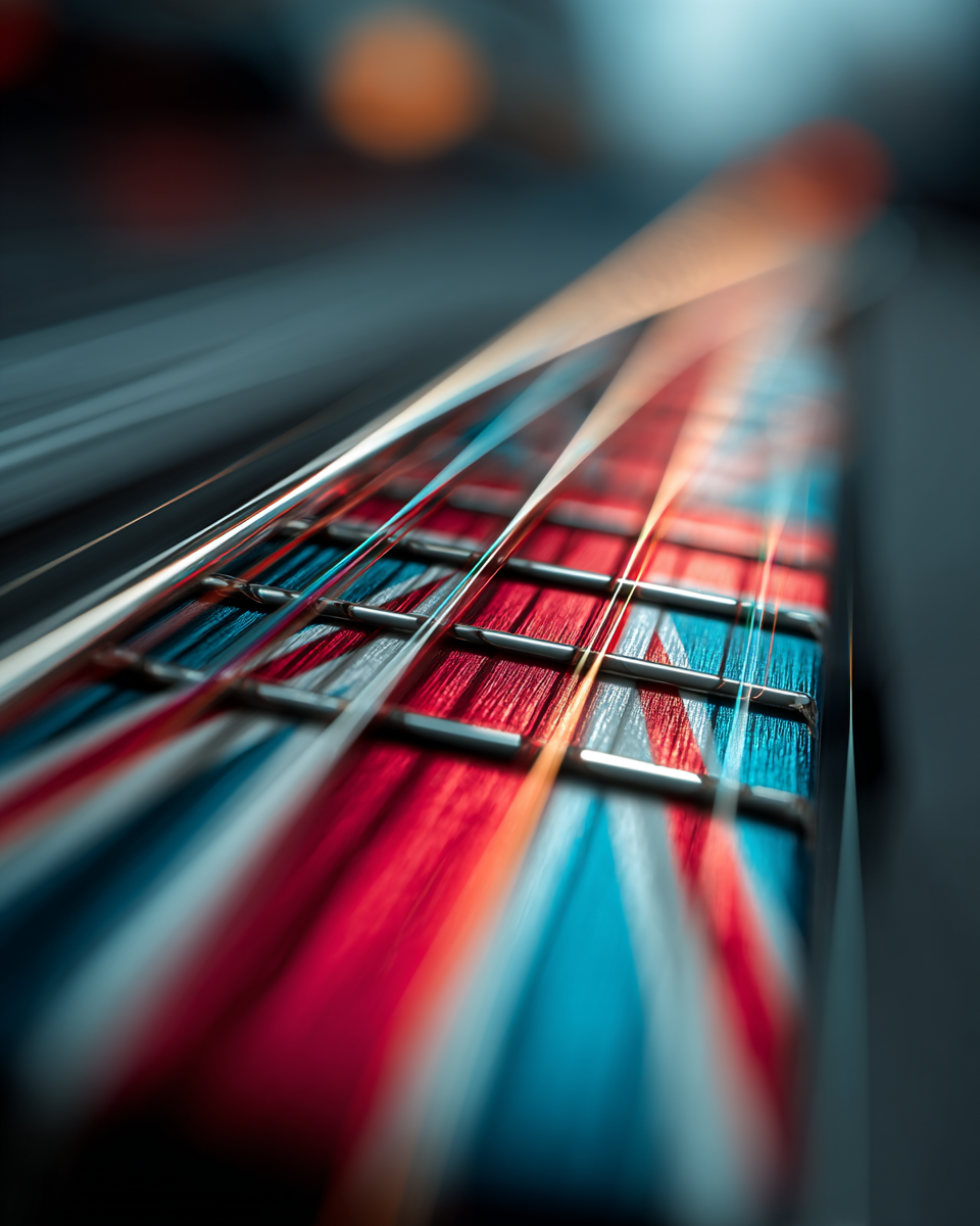
기타의 넥 부분을 클로즈업 한 이미지에서는 시간의 속도감이 느껴졌다. 마치 기타가 시간을 관통하는 듯한 역동감을 체감할 수 있었다.
- 비교: 단순한 오브젝트 vs 시간성을 담은 비유적 이미지
단순 오브젝트는 깔끔하고 안정적이지만 감정적 여지는 제한적이었다.
그러나 시간이라는 요소가 결합되자 오브젝트가 훨씬 풍부한 감정을 담게 되었고, 이들이 결합하는 순간의 힘은 그 아무도 막을 수 없다는 생각이 들었다.
우리는 삶은 살아가며 사람들에게, 심지어 사물들에게 애착을 가지며 살아간다. 세월을 함께 견디며 나아간 순간의 공유는 어떤 힘보다도 강하게 작용할 수 있다. 이를 잘 활용해서 사용자의 추억이나 감정을 공감할 수 있을만 한 그런 디자인을 하는 것이 중요함을 체감했다. - 개인 의견: 시간적 요소를 강조하거나 다른 방식으로 표현하면 어떻게 달라질까?
시간을 강조하는 표현은 여러 방향으로 확장될 수 있다. 기타의 넥을 과장해 늘리거나, 스트링을 시간선처럼 비유적으로 다루거나, 반대로 극단적으로 부식된 현실적 표현을 시도해도 된다.
방식이 달라질수록 분위기 또한 서정적, 역동적, 초현실적으로 크게 달라지며, 시간성은 오브젝트의 감정과 해석을 강하게 바꾸는 요소임을 깨달았다.
번외)
달리의 그림 <기억의 지속>을 스타일 레퍼런스 삼아 제작한 이미지들

⭐️ 느낀 점
몇번을 진행하려다 실패한 기타를 드디어 이용해 훈련을 진행했다.
그래도 모두 저번에 한번 발표를 해서 그런지, 덜 긴장하고 작업하신 내용들을 열심히 공유해 주셨다.
특히 왜 그런 의도로 했는지를 직접 듣는다는게 생각의 폭을 넓혀 주는 것 같다.
같은 오브젝트로도 다른 표현과 의미가 담기는 것이 신기했고, 분위기 환기도 되는 것 같아 좋다.
나는 열정이 그리 넘치지 않는 편인데, 열심히 하려는 사람들과 있으면 좋은 자극을 받는다.
🧩 아쉬운 점 / 개선 방안
다른 분들이 표현한 방식을 보니 시간이라는 주제가 보다 직관적으로 드러난 것 같아 멋있었다.
시간이라는 틀에 갇혀서 너무 다른 사람들과 중복되는 오브젝트를 사용하기는 싫어서 좀 더 꼬아서 생각해 골랐는데, 역효과인가 싶기도 하고 시간이라는 개념이 직접적으로 드러났는지 스스로 좀 의문이 들었다.
표현 방식에서 녹는 이미지를 생성할 때 충분히 원하는 만큼 녹아내리지 않아 아쉬웠다.
형체가 반은 녹길 바랬는데 무늬 프롬프트가 너무 강하게 씌워진 탓 같다.
시간 나면 그냥 기타로도 얼마나 녹는지를 실험해봐야겠다.
갑자기 weird나 chaos 파라미터를 더 넣어도 좋겠다는 생각이 들었다.
2. 미드저니 웹 미니 특강
웹버전 출시 이유- 접근성을 높이고 사용자 경험을 개선하기 위해
웹- 에딧 기능 강화,
파라미터 대신 세팅
영상 시작과 끝 프레임을 정하면 5초짜리 영상 제작가능
기능은 대체로 비슷하지만 UI가 간소화
move- resize
paint- 직접선택도구
add- 다른 이미지나 제품을 이미지에 추가 가능
retexture
personalize- 자신이 원하는 톤의 이미지들을 선택해 개인화 가능, 이미지를 일관된 톤으로 200장 뽑아야해서 해당하지 않는 이미지는 넘기면 됨

디자인 워크플로우
지피티에게는 단답형인 질문보다 페계적으로 질문할 수록 답변의 질이 높아진다고 한다.
지피티에서 사용할 수 있는 프롬프트 생서익도 공유해주셔서 잘 활용해봐야겠다.
나노바나나 프로
이제 한글까지 완벽에 가깝게 구현하는 것을 보니 발전 속도를 체감할 수 있었다.
⭐️ 느낀 점
아직 웹으로는 안써봤는데, 기능이 은근 달라 잘 활용할 수 있는 부분이 있어보인다.
🧩 아쉬운 점 / 개선 방안
오늘 한번 해보고 싶었지만 개인 과제 때문에 못했다.
주말... 은 모르겠고 다음주에라도 사용해봐야겠다.
3. 개인과제
어제 진행하다 마무리짓지 못한 편지지와 달력 아이콘을 마저 진행했다...
편지지 아이콘
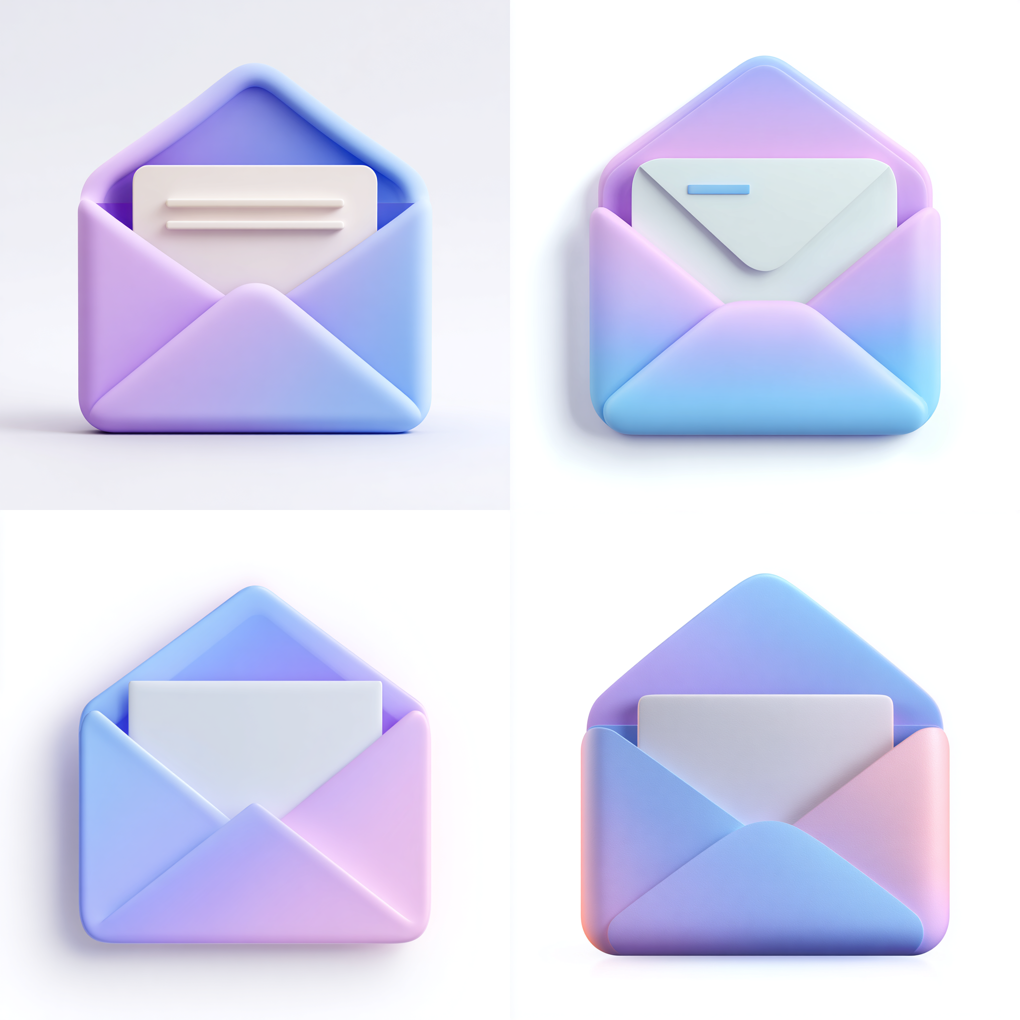
1차 시기
an icon of an envelope with a soft purple-to-blue gradient, an open envelope with a long rectangular white letter that extends slightly above the top flap, smooth clay material, ui icon style, simple and clean design, soft lighting, high-definition 3d rendering, white space at the top and bottom, clean white background
내부 편지지의 크기나 질감 묘사가 부족하며 쓸데없는 디테일이 들어가 있다.

2차 시기
an open envelope icon with a soft purple-to-blue gradient, clean clay-like material with rounded folds and smooth edges, inside the envelope, a single semi-transparent white letter with a subtle glass-like texture, the letter is slightly taller than the envelope flap and protrudes above it, the letter has smooth rounded corners and a faint translucent glow, simple UI icon style, soft lighting, 3d rendering, high-definition details, clean white background with generous white space
내부 편지지가 약간 더 크다는 표현이 애매해서인지 드라마틱한 변화가 없다.

3차 시기
3D icon of an open envelope with a soft purple-to-blue gradient and a matte clay texture, rounded folds and smooth corners, containing a thin frosted-glass letter card that is semi-transparent milky white, softly showing the envelope colors through it, the top edge of the letter clearly visible above the envelope flap, with smooth rounded corners, simple UI icon style, soft lighting, high-definition 3D rendering, clean white background with generous white space.
투명에 대한 설명을 더 명확히 넣었는데, 편지지가 투명해진 대신 요상하게 두겹으로 생성되었다.

4차 시기
an open envelope icon with a soft purple-to-blue gradient and a matte clay texture, inside the envelope, one single letter card with smooth rounded corners, the letter has a frosted-glass surface coating with a subtle translucent sheen, the card itself remains single-layered and solid, not separated, the top edge of the letter rises slightly above the envelope flap, simple UI icon style, soft lighting, 3d rendering, clean white background with generous white space
퇴행당했다. 부족한 점이 하나도 채워지지 않았다. 프롬프트가 너무 복잡해진 탓인 것 같다.

5차 시기
an open envelope icon with a soft blue-to-purple gradient, inside it, one tall rectangular letter card that is clearly longer than the envelope flap, the top part of the letter extends visibly above the flap, the letter has smooth rounded corners and a light translucent look, simple 3d clay-style icon, soft lighting, clean white background
내용이 길어지지 더 꼬이는 것 같아 원점으로 회귀하여 부족한 부분만 포인트를 집어 나가기로 했다.
내부의 편지지를 크고 키큰 직사각형으로 명시하는 방법을 선택했는데, 직사각형은 얼추 들어줬지만 크기는 커지지 않아 오히려 더 작아보이는 역효과가 있었다.
6차 시기
an open envelope icon with a soft blue-to-purple gradient, inside it, one big tall rectangular letter card that is clearly longer than the envelope flap, the top part of the letter extends visibly above the flap, the letter has smooth rounded corners and a light translucent look, simple 3d clay-style icon, soft lighting, clean white background
아직도 봉투 윗부분을 덮을 정도의 종이 크기는 생성이 안된다.

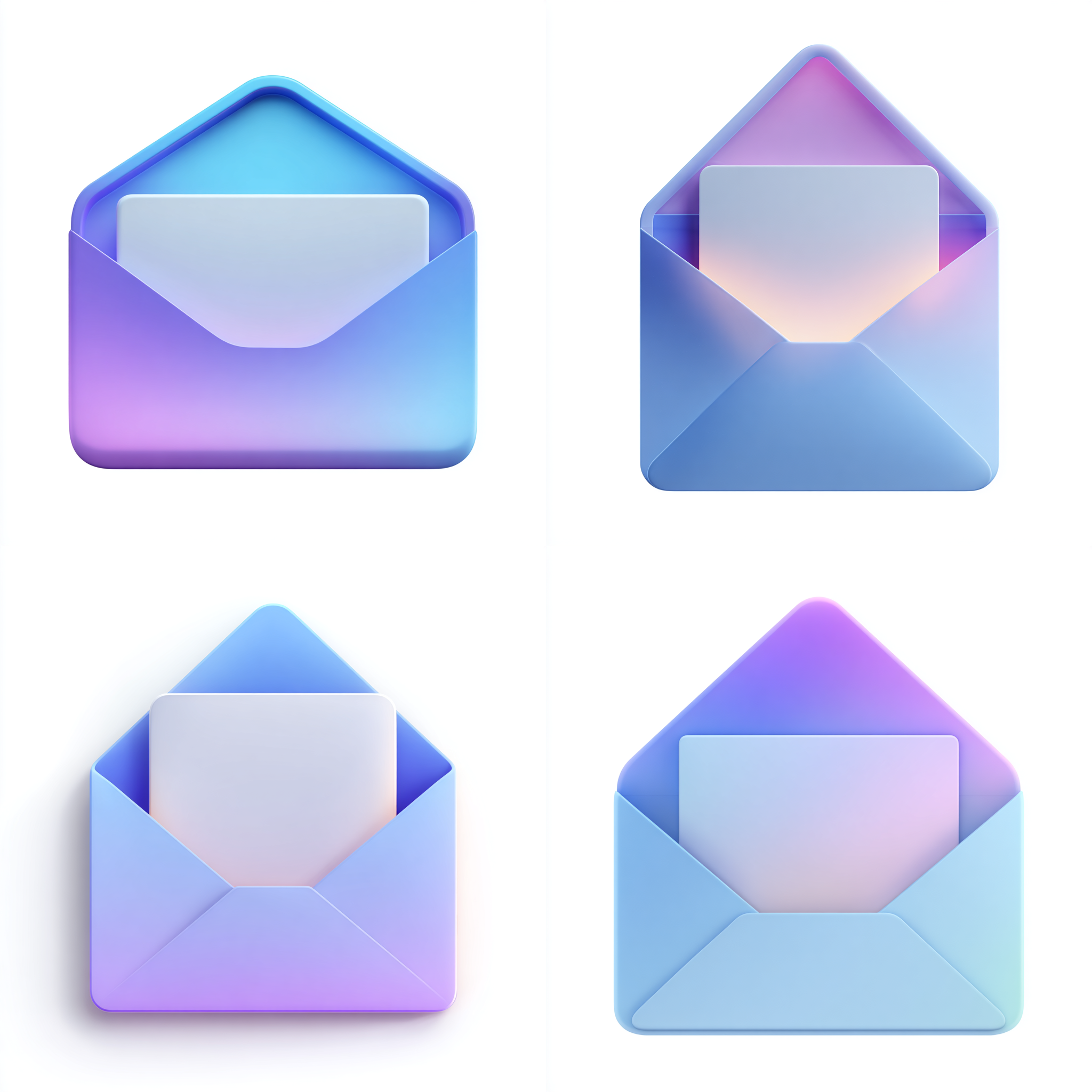
7차 시기
an open envelope icon with a soft blue-to-purple gradient, inside it, one big tall rectangular letter card that is clearly longer than the envelope flap, the top part of the letter extends visibly above the flap, the letter has smooth rounded corners and a light translucent look, simple 3d clay-style icon, soft lighting, clean white background
지금까지 중에 제일 비슷하게 뽑혔다. 명백히 봉투 윗부분보다 높은 위치라고 명시한 부분이 잘 작동한 것으로 보인다.
다만 불투명도가 아쉽고, 크기도 아직 충분히 크지 않다...
여기서 마무리 하려다가 튜터님께 문의드린 후, 갑자기 오기가 생겨서 더 해보다가 지쳐버렸다.
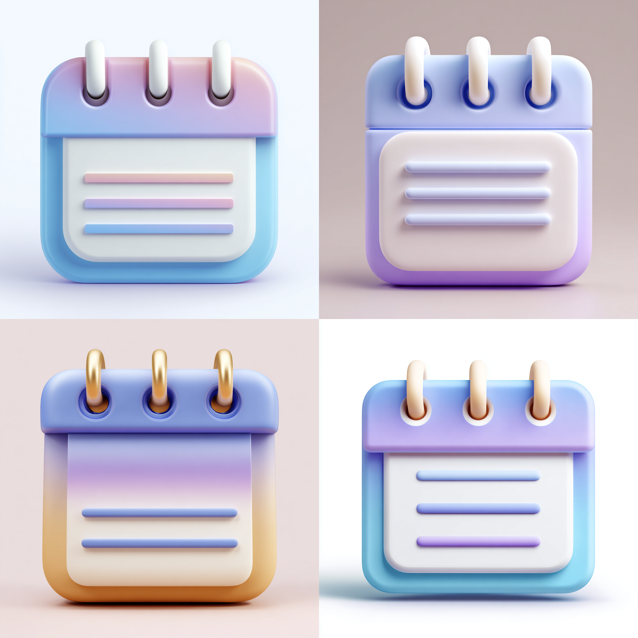
달력 아이콘

1차 시기
simple 3D calendar icon with exactly three big circular holes along the top edge, three soft white binder rings inserted through those top holes, a white rectangular page panel with three horizontal rounded lines, soft blue-to-purple gradient on the top cover, smooth rounded corners, clay-like 3D style, soft lighting, clean white background
페이지가 달력 프레임 안에 완전 들어가야 하는데, 갈라진 듯한 모습이라 실패다.
2차 시기
simple 3D calendar icon with three large drilled circular holes along the top frame, three soft white binder rings inserted through those holes, a white rectangular page panel placed fully inside the lower frame, the page stays inside the frame area and does not extend outside, the page has three horizontal rounded lines, soft blue-to-purple gradient on the top cover, wide horizontal calendar shape, smooth rounded corners, clay-like 3D style, soft lighting, clean white background
색감이 아쉽고, 길이가 너무 정사각형 모양인 점이 아쉽다. 펀치홀도 너무 링에 딱맞다.

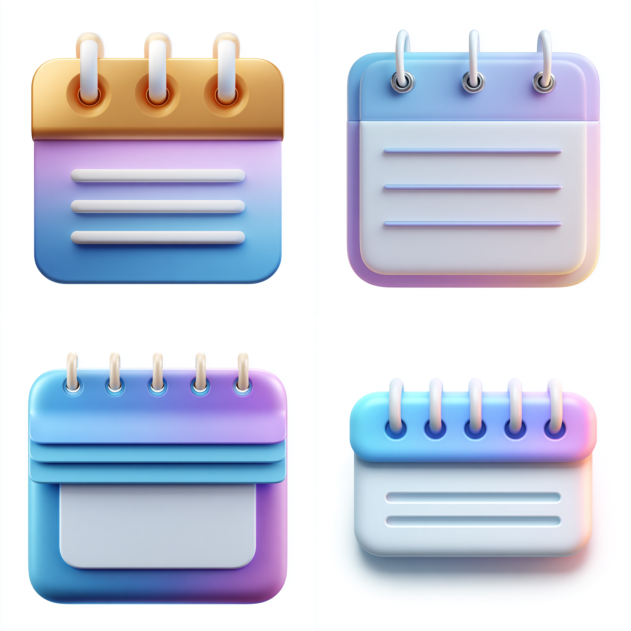
3차 시기
simple 3D calendar icon with three large big drilled circular holes along the top frame, three soft white binder rings inserted through those holes, a white rectangular page panel placed fully inside the lower frame, the page stays inside the frame area and does not extend outside, the page has three horizontal rounded lines, soft blue-to-purple gradient on the top cover, wide horizontal calendar shape, smooth rounded corners, clay-like 3D style, soft lighting, clean white background
색감은 복구, 하지만 여전히 다른 문제들 해결이 안된다.
4차 시기
simple 3D calendar icon, wide horizontal shape, clay-like 3D style, three extra-large drilled circular holes aligned evenly along the top bar, three thin soft white binder rings inserted cleanly through those holes, a white rectangular page panel placed fully inside the lower frame area, the page panel does not rise above or extend outside the frame, the page has three smooth horizontal rounded lines, top bar uses a soft blue-to-purple gradient, smooth rounded corners, soft lighting, clean white background
프롬프트가 과해졌다. 여러모로 역효과만 났다.
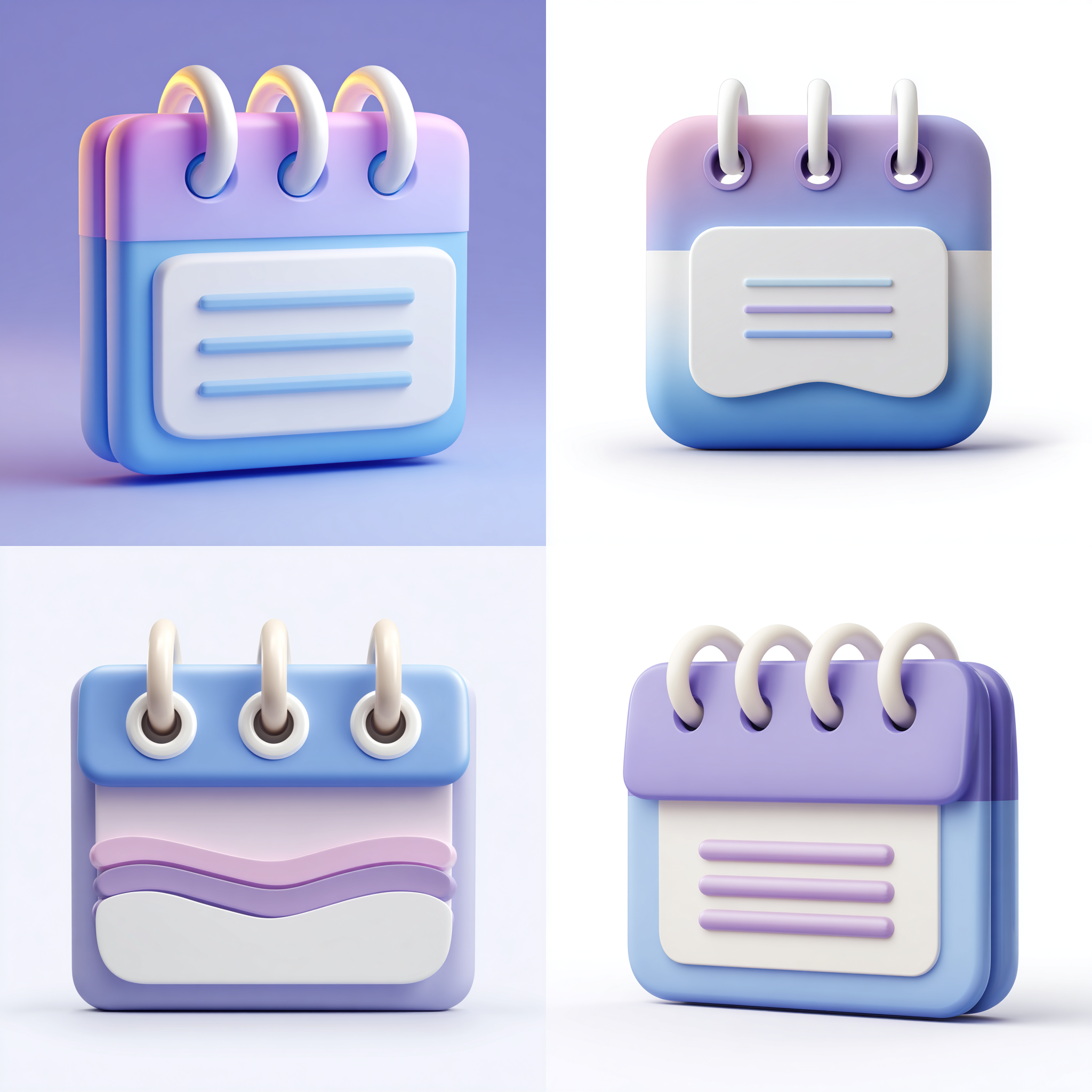
5차 시기
simple 3D wide calendar icon with three large big drilled circular holes along the top frame, three soft white binder rings inserted through those holes, a white rectangular page panel placed fully inside the lower frame, the page stays inside the frame area and does not extend outside, the page has three horizontal rounded lines, soft blue-to-purple gradient on the top cover, wide horizontal calendar shape, smooth rounded corners, clay-like 3D style, soft lighting, clean white background
갑자기 저런 뜬금없는 물결무늬는 왜 나오는걸까...

5차 시기
simple 3D wide calendar icon with three large drilled circular holes along the top frame, three soft white binder rings inserted through those holes, a white rectangular page panel placed fully inside the lower frame, the page stays inside the frame area and does not extend outside, the page has three horizontal rounded lines, soft blue-to-purple gradient on the top cover, wide horizontal calendar shape, smooth rounded corners, clay-like 3D style, soft lighting, clean white background, front-facing flat angle, no tilt
/describe가 그렇게 도움이 되는건지 모르겠다.
왜 나는 저거로 묘사된 설명으로 보완하면 이미지가 더 이상하게 생성되는걸까.
⭐️ 느낀 점
내가 너무 이미지를 못 만든다는걸 느꼈다.
너무 대책이 없는 것 같다.
보다 분석적으로 프롬프트를 보고 기록하려고 노력중이고, 그렇게 하니 좀 더 짜임새가 있게 만들어지는 경우가 늘어난 것 같긴 하다.
🧩 아쉬운 점 / 개선 방안
한글 번역과 영문 프롬프트를 보다 꼼꼼히 비교 분석해봐야겠다.
그리고 과제가 나오면 문제좀 똑바로 읽자.
며칠 고생해놓고 아깝게 이게 뭔지 모르겠다.
꼬였다 꼬였어.
🏃♂️➡️WIL (3주차)
Keep(유지할 것):
- 디자인 감각 훈련 빼먹지 않기.
- 캠프 활동 성실히 참여하기.
- 계속 실습 및 연습 해보며 감각 익히기.
- 어찌 됐든 앉아 있기.
- 좀 더 현실적인 목표 생성.
- 쉬는 시간 관리 및 거실에 핸드폰 두기.
- 알람 두개 맞추기
Problem(문제점):
- 외부의 문제로 기분이 좌우됨.
- 초반에 막히면 끝날 때까지 기분이 좋지 않음.
- 운동을 여전히 제대로 못함.
- 심지어 5일동안 집 밖을 못나감.
- 안되는게 있을 때 과하게 스트레스를 받음.
Try(시도할 것):
- 아예 목표를 가능한 만큼만 잡아보기.(내 평균 진행 속도에 맞춘 현실적인 목표 파악)
- 그렇다고 그 목표만 끝내는게 아닌 가능하면 목표 이상을 해보도록 하기.
- 안되는 일에 미련 갖지 않기.
- 교육 시간 이후에 운동하기.(제발)
- 운동을 못하면 밖에 나가기라도 하기.
- 부정적인 감정에 사로잡히지 않기.
- 자기 비하 금지.
- 스트레스 풀 방법 찾아보기.
🦾총평
WIL은 저번주 적은 거에서 그리 달라진게 없는 것 같다.
시간 활용도 잘 못하는 것 같고, 오히려 빨리 지쳐버리다보니 일정이 다 끝난 후 누워서 아무것도 못해버릴 때도 많다.
TIL도 점점 적을 내용이 많아지고 정돈되게 적으려 하다보니 작성 시간이 점점 늘어나버린다.
거의 10시, 11시에 글을 업로드하니 거의 개인 정비 시간이 부족한 셈이다.
그래서 TIL을 캠프 운영 시간에 바로바로 적으며 그때 그때 기록하는 습관을 들이고 있는데도 정리가 쉽지 않다.
재충전이 필요한 시기 같다.
미드저니 바보같이 1년치 구독했다...
이렇게 비싼거였구나 하고 있었는데 그냥 냅다 1년치를 결제해버린 것이니 비싼게 당연하지.
자괴감의 늪에 또 빠질 뻔 했지만 발만 담그고 빠져나왔다.
그냥 해결하면 되는거니까, 다음달에 다른 카드로 결제하고 잘 해결해봐야지.
환불도 그렇게 해결하면 되지 않을까.
좀 꼼꼼히 좀 보자 제발.
😳이번주의 무-드.
한달쯤 되니까 정신적 체력적으로 지쳐 가는게 확연히 느껴진다.
'AI 콘텐츠 디자이너 부트캠프' 카테고리의 다른 글
| [TIL] 내배캠 AI 콘텐츠 디자이너 17일차 (2025.11.25) (0) | 2025.11.25 |
|---|---|
| [TIL] 내배캠 AI 콘텐츠 디자이너 16일차 (2025.11.24) (0) | 2025.11.24 |
| [TIL] 내배캠 AI 콘텐츠 디자이너 14일차 (2025.11.20) (0) | 2025.11.20 |
| [TIL] 내배캠 AI 콘텐츠 디자이너 13일차 (2025.11.19) (1) | 2025.11.19 |
| [TIL] 내배캠 AI 콘텐츠 디자이너 12일차 (2025.11.18) (0) | 2025.11.18 |